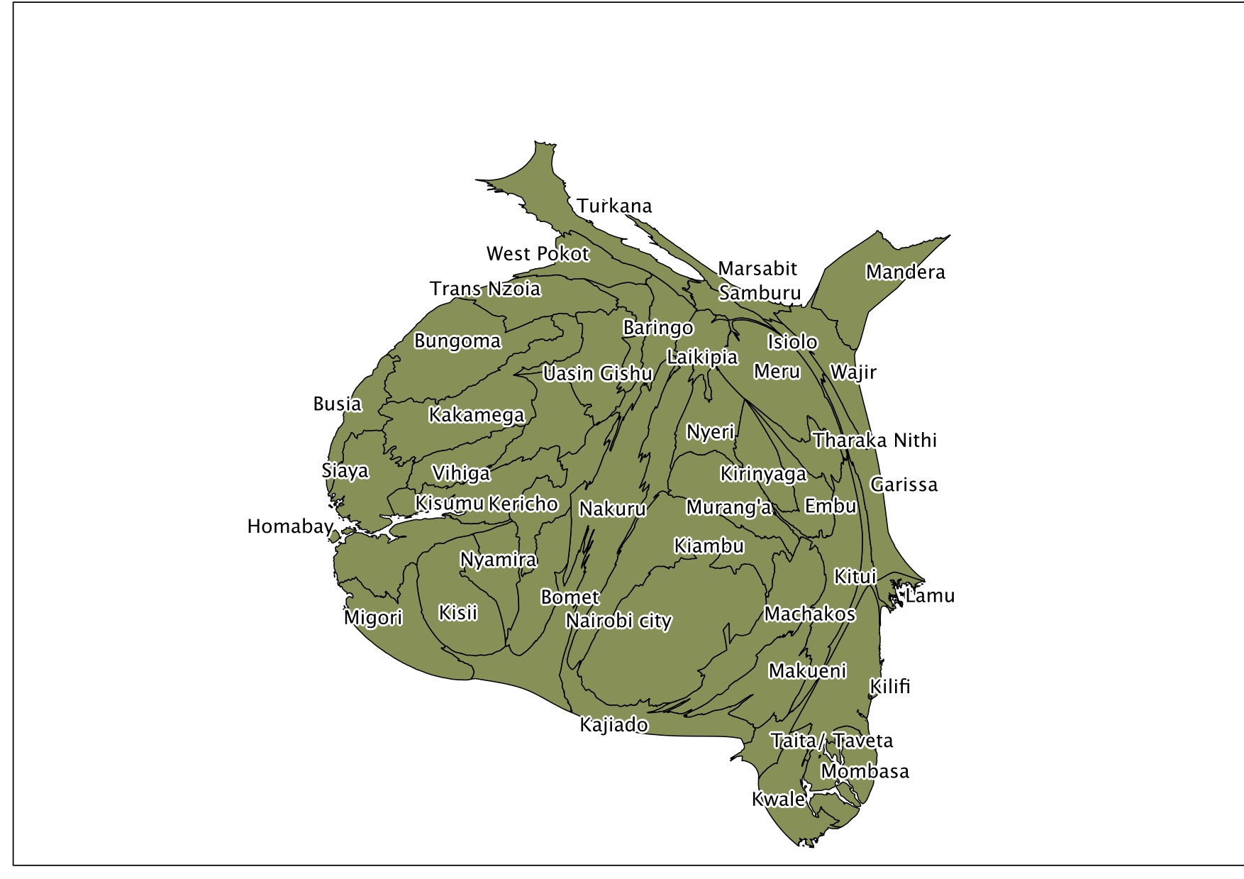
I was cleaning out my downloads folder, and I remembered I had made this cool map of Kenya that uses the algorithm of Scharl an Weichselbraun to make a density equalizing map of Kenya. This map shows each of Kenya’s counties with the area proportional to the voting age population. You can see how unequal the county sizes are in the map.